The Scoop: Sameness in Beauty Packaging
How can brands standout when they all look the same? A look at current beauty trends and what's next with Claire Moskal.
Welcome to Beauty Bureau!
Today’s Letter: I’m introducing a new segment: The Scoop—an interview and/or deep dive on a topic of interest. Today’s Scoop looks at beauty packaging trends and what some brands are willing to do to go viral...like a lip gloss phone case perhaps.
Around the Web
What happened to Essence Fest this year? Fake outrage of the week—Essence Fest. I’ve never attended Essence Fest and therefore I can’t make a judgement on the events or scheduling. However, based on observations and memory, Essence Fest marketing paled in comparison to last year. I rarely saw marketing efforts leading up to this year’s festival with the exception of a few IG posts here and there. Moreover, they were confirming artist lineups days (if not hours) before day one. The general consensus from what I’ve read: there are areas of opportunity.
To be honest, the biggest news is that this June marks the 3rd highest month of unemployment for Black women. As a reminder, over 100,000 Black women became unemployed in April.
Sula is looking for LA Beauties. Sula R&D is conducting a paid inclusivity validation study this Friday, July 11th. LA beauties comment under the thread linked here to express interest to participate.
The Scoop: Sameness in Beauty Packaging
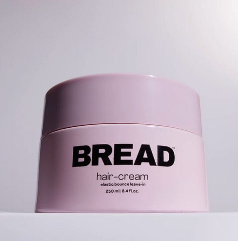
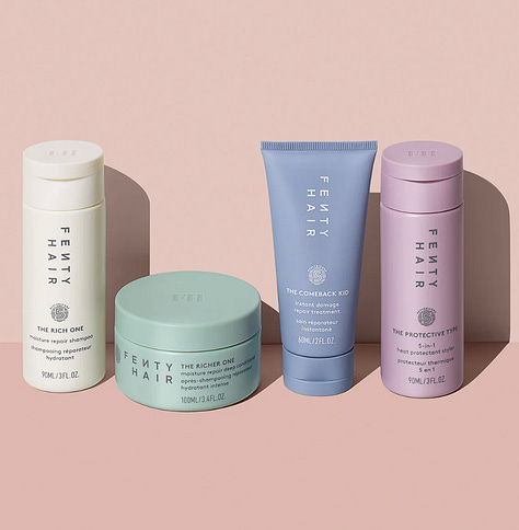
Doesn’t it feel like beauty packaging is beginning to look the same? I started noticing that many beauty brands’ packaging across various industries were starting to look like distant cousins. Akin to when everything was dripped in millennial pink during the mid 2000s, current beauty packaging appears to follow a similar formula: monochromatic, sleek bottles with a sans serif and bold font in soft, neutral hues…or green. As packaging is beginning to look the same, product efficacy should become the priority, if that’s even a brand’s concern.
Recently,
shared on LinkedIn that the marketing industry is suffering from a creative sameness epidemic. As brands cut their marketing and creative teams and budgets the demand for content increases. But to meet the demand, brands will regurgitate and replicate copy, images and design to protect the bottom line and capture people’s attention.


While the beauty industry is chugging along, consumers’ wallets are being pinched left and right and fatigue is on the rise. Nevertheless, consumers are still shopping albeit more intentional and brands have to decide whether to take calculated risks or be “inspired by” each other to generate revenue.
I invited Claire Moskal, brand designer and founder of creative design studio, Studio.Studio, to discuss current beauty packaging trends, if brands are prioritizing efficacy over being trendy and where she thinks beauty brand packaging is headed to next.
“When it comes to cultural trends such as “Trad Wives” or “Soft Life”, I don't see the packaging design specifically being tailored to trends but rather how much is being consumed in order to live up to those lifestyle tropes.” - Claire Moskal
Bread (haircare), Seed (supplement), and Sync Beauty (makeup) have similar packaging designs. I'm noticing brands are moving to sleek minimalist tubes in soft and/or natural colors. In your opinion what are 3 brand packaging trends you're seeing in the beauty and wellness space?
I love this question because every new launch in the beauty and wellness space feeds off of a trend in some capacity to grab interest. The market is more saturated than it's ever been. This means as a consumer you've never had more choice or a higher chance of getting exactly what you're looking for as you do now.
As a designer, this means that there's a fine line between feeding into trends to get eyeballs and purposefully standing out to avoid being ignored. As a result, I think that a lot of packaging starts to look similar because of what we like online and the algorithm responds to it: "if you liked X, then you're sure to love Y & Z!" and that's by design. Minimalist packaging with logo placement is one trend. I think Glossier started this in 2014 and we’re still riding this wave. I don’t see that stopping any time soon.
Keep reading with a 7-day free trial
Subscribe to Beauty Bureau to keep reading this post and get 7 days of free access to the full post archives.


